The Hub Brand Guideline

The Hub Brand Guideline

DESIGN:

Branding | Identity

CLIENT:

AFS Technology Hub

ROLE:

Brand Designer

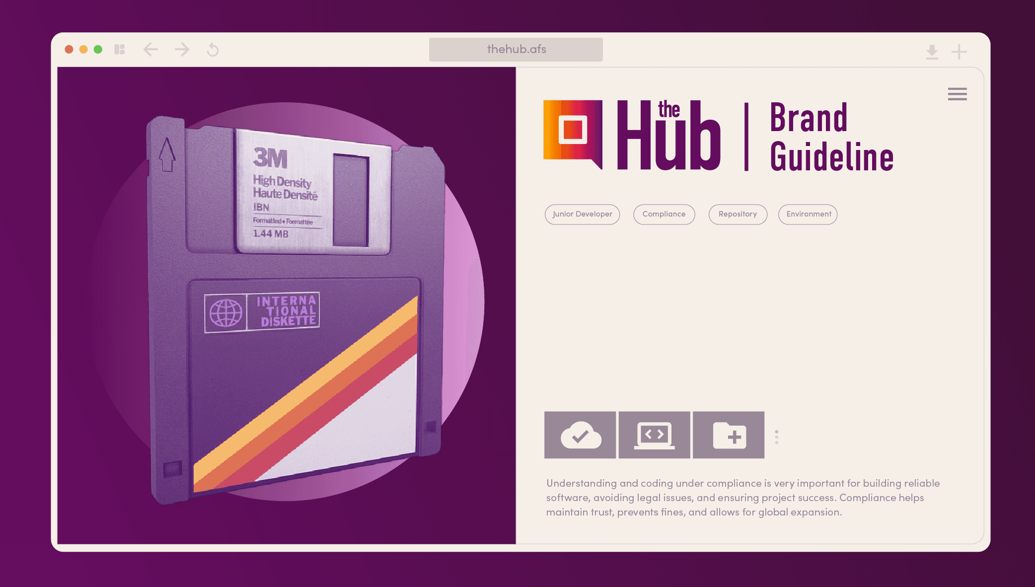
The AFS Technology Hub was tasked with developing digital products that centralize resources for junior developers and users with limited familiarity of federal government technologies. The project was called The Hub.

The AFS Technology Hub was tasked with developing digital products that centralize resources for junior developers and users with limited familiarity of federal government technologies. The project was called The Hub.

The AFS Technology Hub was tasked with developing digital products that centralize resources for junior developers and users with limited familiarity of federal government technologies. The project was called The Hub.

Challenge

Simplifying complex information to help users make informed decisions about which digital product would best suit their needs.

Simplifying complex information to help users make informed decisions about which digital product would best suit their needs.

[ Solution ]
[ Solution ]

The Hub would involve cross-functional collaboration to identify the necessary assets, beginning with creating a brand guideline to establish a consistent foundation for all design efforts.

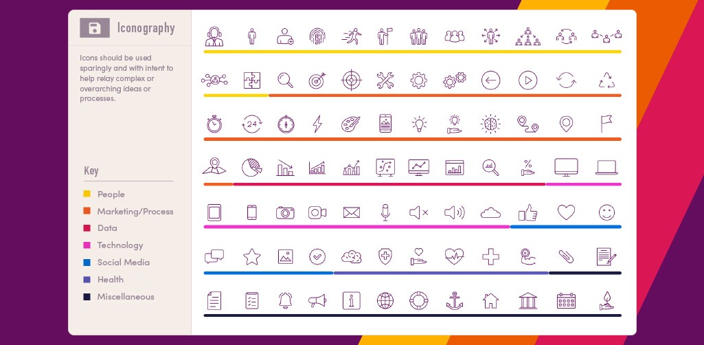
The brand guidelines were intentionally designed to convey a more approachable tone, reflected through the entire visual system.

[ Typography ]

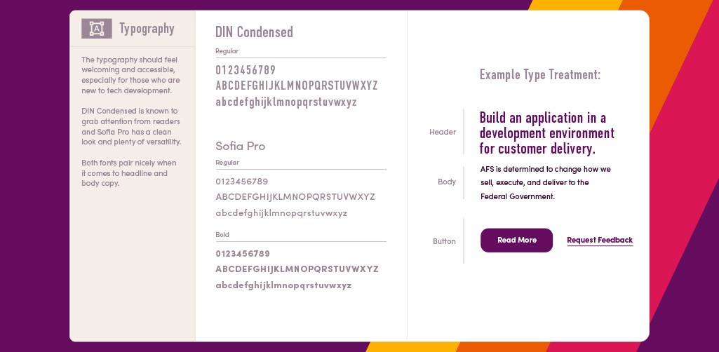
Typography was carefully selected to offer flexibility in presenting complex information, ensuring clarity and readability for content that required closer attention.

Typography was carefully selected to offer flexibility in presenting complex information, ensuring clarity and readability for content that required closer attention.

[ Two Environments ]

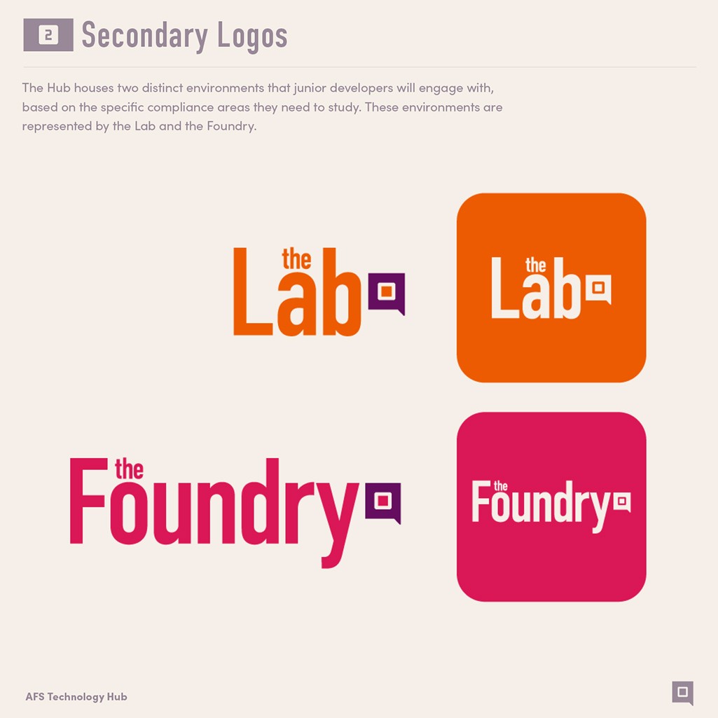
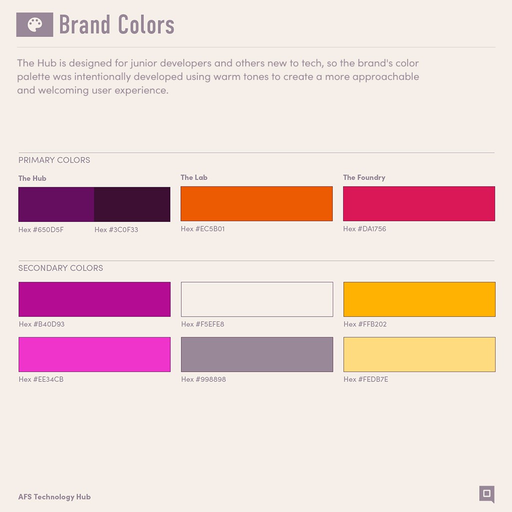
To support a more approachable and engaging experience—especially in contrast to traditional technology standards—a warm color palette was introduced along with secondary brand identities, named The Lab and The Foundry.

The idea was to create two distinct environment sets, each aligned with different compliance requirements, to help users make more informed and confident decisions.

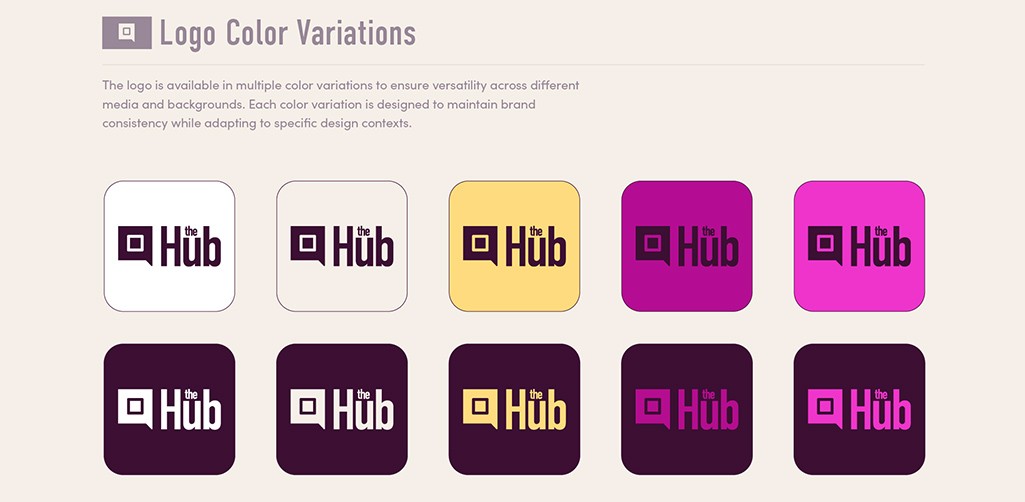
[ Logo Colors ]
Results

Given the strict compliance requirements and varied development environments mandated by the federal government, the team was able to present content in a clear, digestible way while maintaining accuracy and regulatory alignment.